
Old Landing Page

About
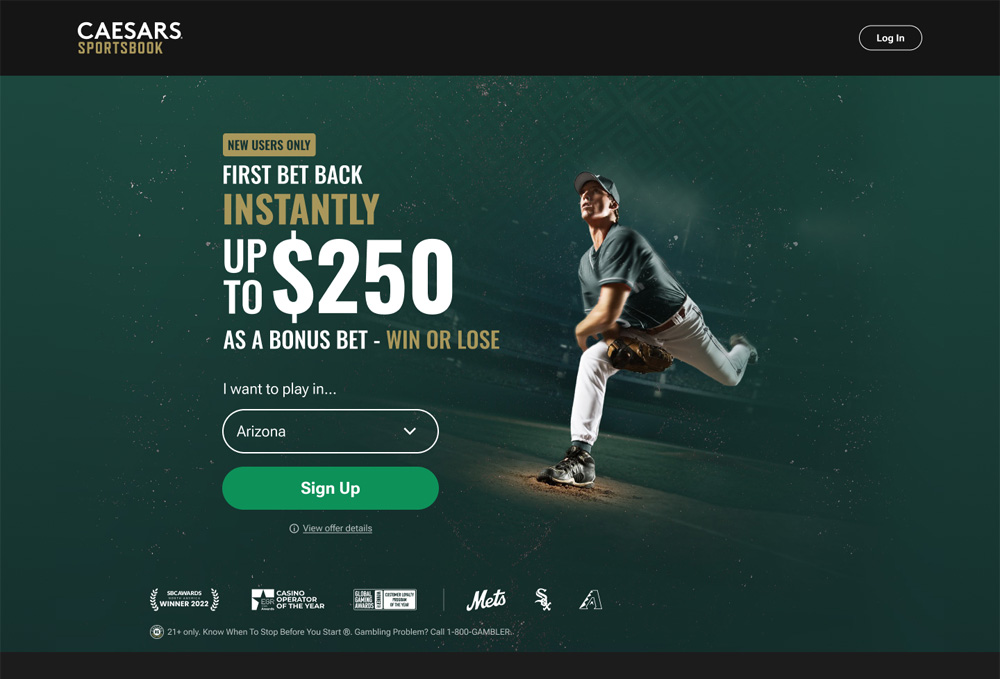
When I first visited the Caesars Sportsbook landing page, I was surprised by how poorly it reflected such a reputable brand. The layout was cluttered, key messages were buried, and the overall experience undermined trust.
I took it on as a redesign challenge and saw a chance to create a landing page that not only looks aesthetically pleasing, but is geared towards converting potential players. My goal was to apply UX/UI principles that would clarify the offer, build trust, and guide players toward signing up.
Key improvements:
- Clear visual hierarchy: I made the welcome offer the hero of the page, improving both its focus and readability.
- Trust signals: I added Caesars numerous awards and leveraged their sponsorship IP.
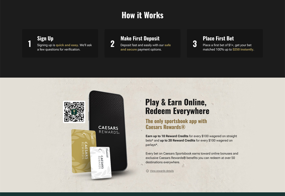
- Reward highlights: Introduced imagery through icons to showcase Caesars Rewards.
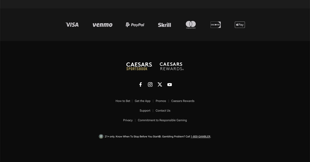
- Trust-building cues: Displayed payment method logos to reassure potential players.
- Concise copywriting: Stripped away the fluff, focusing on the most compelling benefits.
- Consistency & readability: Standardized typography, spacing, buttons, and element styling.
- User journey focus: Removed unnecessary links that distracted from signing up and led players astray.
- Optimized CTAs: Designed buttons that were prominent, consistent, and aligned with the Caesars brand.
The result was a modern, visually appealing landing page that communicates value instantly, strengthens brand trust, and encourages action.
*I have not been contracted by Caesars for work.
Tools
 Figma
Figma  Photoshop
Categories
UX/UI & Web Design
Client
Caesars Sportsbook