


Old Landing Page

About
The Jackpot City Casino landing page required a full redesign to enhance usability, visual appeal, and conversion performance.
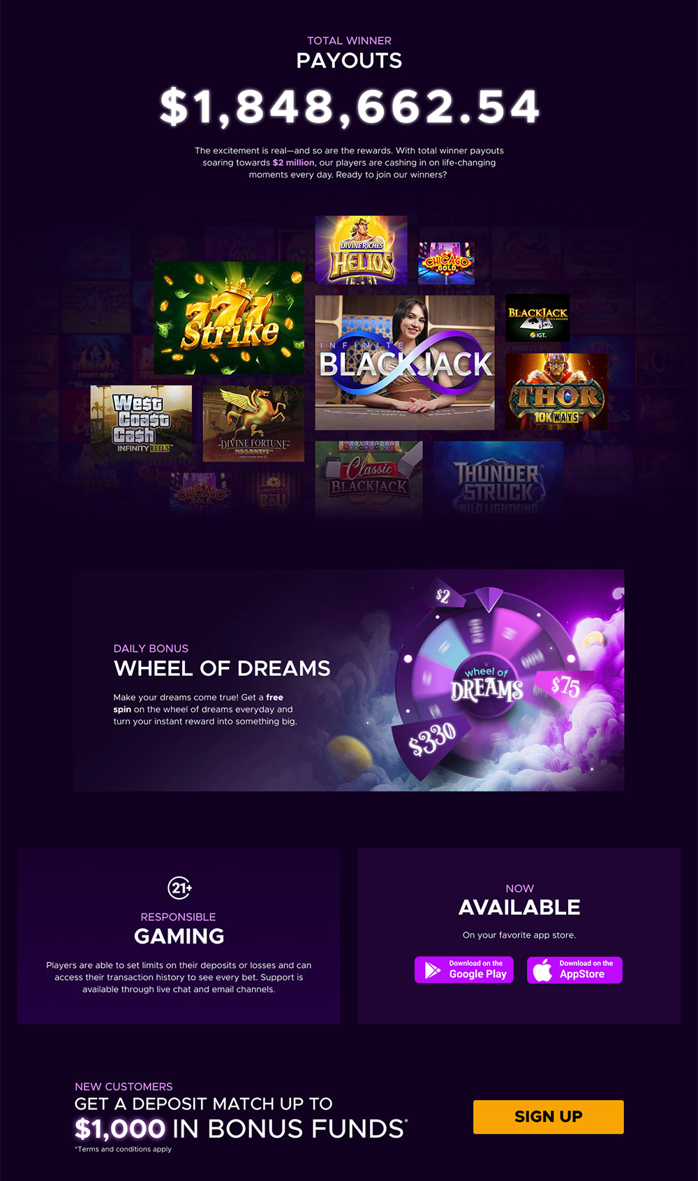
My primary objective was to apply core UI principles to break the page into clearly defined, digestible sections. This structure helps users better understand the product features without feeling overwhelmed. Careful attention was given to whitespace to elevate the visual hierarchy and create a more polished, trustworthy experience.
Key Improvements:
- Applied Core UI Principles: Introduced simplicity, visual hierarchy, consistent alignment, contrast, proximity, and shape usage to create a cohesive and intuitive layout.
- Feature Prioritization: Highlighted the most compelling product features—such as the Bonus Wheel and real-time Winner Payouts—to grab attention and drive engagement.
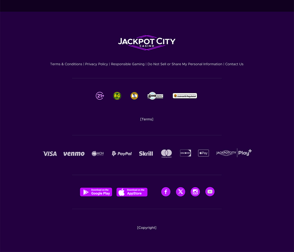
- Integrated Trust Signals: Incorporated visual trust signals including: US Integrity, DGE Gaming Enforcement, and NCPG responsible gaming badges.
- Reward Emblem Redesign: Introduced a fresh set of reward icons to enhance brand appeal and communicate value.
Outcome:
By improving information flow and reducing cognitive load, the redesign helps users more easily understand our offerings. This is ultimately aimed at boosting user trust and increase conversion rates.
Tools
 Figma
Figma  Photoshop
Categories
UX/UI & Web Design
Client
Jackpot CIty Casino